〈☉☉ Unpacking Ambition〉Korea’s Visual-First Boom: Inside Five Striking Alcohol Can Designs
When a Drink Becomes a Fashion Statement
On retail shelves, most products attract shoppers with bold flavor names and glossy food photography. Japan’s SUNTORY, for example, has long set a polished and distinctive standard for convenience-store packaging. Yet the Korean alcoholic drinks I have recently encountered in Taiwan’s convenience stores approach design very differently: some foreground fashion and style, while others sell the romance of travel. Many Korean brands are especially adept at bringing the logic of “fast fashion” into packaging. The aim is no longer simply to make a drink look delicious, but to create an object that photographs beautifully,and works almost like an accessory.
In my view, this “visual-first” wave has emerged from Korea’s increasingly mature commercial-design ecosystem and its continual effort to balance marketing with artistic sensibility. The same thinking now shapes alcohol packaging, allowing mass-market drinks to become fashion signifiers and shifting consumption from “buying a product” to “choosing a lifestyle.” I have selected five cases worth watching to unpack the playful ideas behind their packaging.
Case 01 — A Fashion Statement in Its Own Right: PEACEMINUSONE Highball, GD × CU
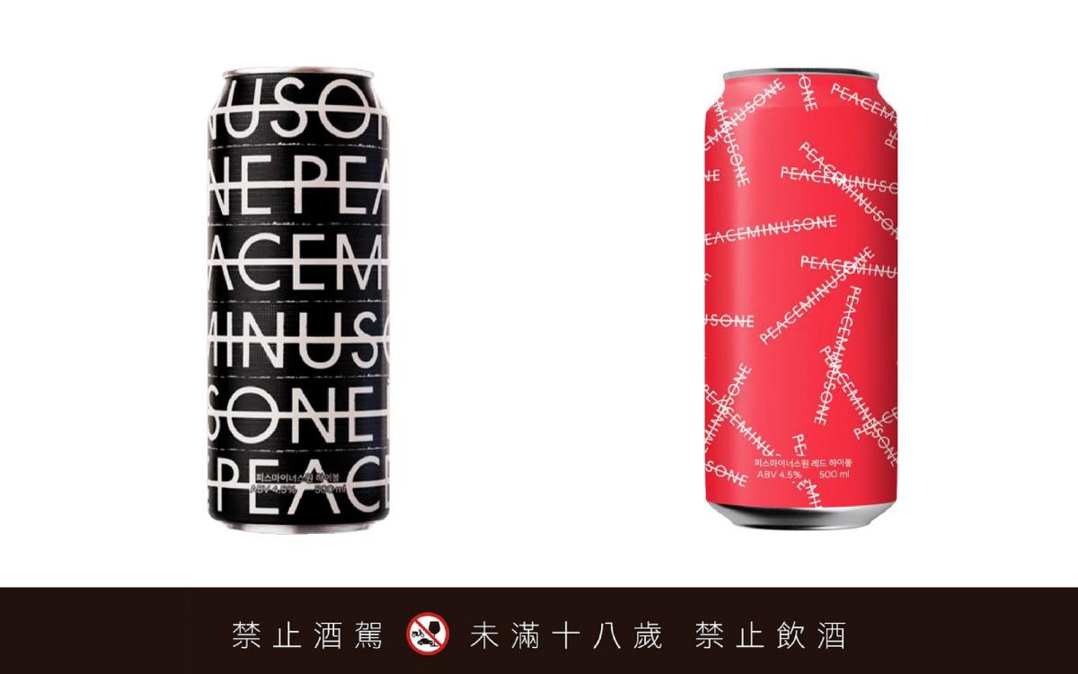
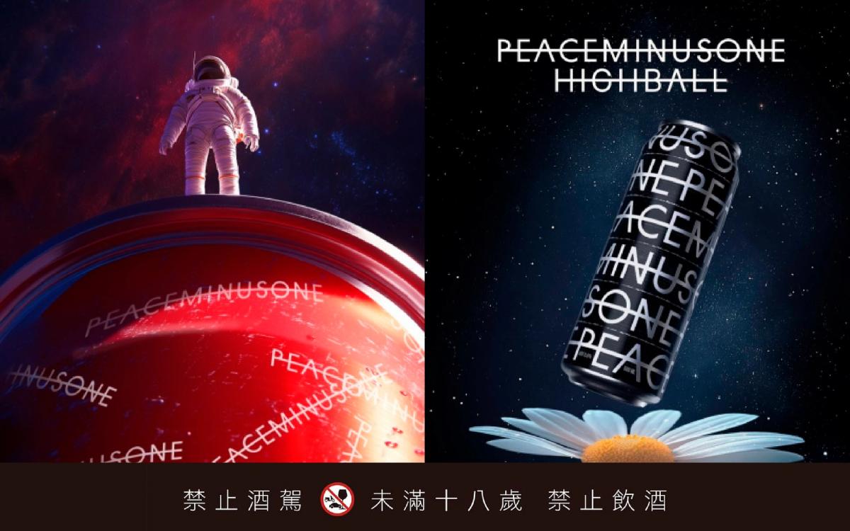
In the fiercely competitive convenience-store channel, how can a product seize attention in seconds? Most canned cocktails rely on photorealistic fruit slices, splashing ice, or conspicuous flavor names, using a literal picture of deliciousness to spark desire. PEACEMINUSONE Highball, created by GD (G-Dragon) with Korean convenience-store chain CU, steps entirely outside that formula. It removes nearly every cue that says “this tastes good” and gives the spotlight to brand identity instead. The packaging can afford to shed its conventional functional cues because GD’s brand already embodies his attitude and sense of style.
At the heart of PEACEMINUSONE is its name: Peace (the ideal, or utopia) + Minus (the minus sign) + One (reality), expressing the gap between reality and the ideal. Its DNA is steeped in the rebelliousness of street art and an aesthetic of disruption. The brand seeks to command a premium through visual appeal. Repeated, interlocking PEACEMINUSONE lettering gives the can a minimalist rhythm that stands in sharp contrast to the visual clutter of a convenience-store shelf. Its matte finish is equally distinct from the reflective metal of an ordinary alcohol can. Every visual and tactile detail has been calibrated to signal the brand’s uncompromising pursuit of quality and refinement.
Most intriguing of all, neither can displays PEACEMINUSONE’s best-known symbol—the daisy missing one petal. Instead, the design relies entirely on pure typography and color. That willingness to edit reveals just how powerful GD’s brand has become: it needs neither the celebrity’s face nor even its most familiar emblem, only an atmosphere through which to speak to consumers. According to ELLE, the collaboration generated enormous buzz in Taiwan even before its launch,with 390,000 cans released across the two variants. Buyers rushed to secure them, and even empty cans appeared on resale platforms—evidence of the packaging’s unusual collectible value. By combining scarcity marketing with design ingenuity, the project overturned familiar assumptions about canned alcohol and celebrity collaborations, turning a convenience-store drink into a full-blown cultural phenomenon.
Case 02 — Redefining the Look of Korean Soju: WON SOJU by Jay Park
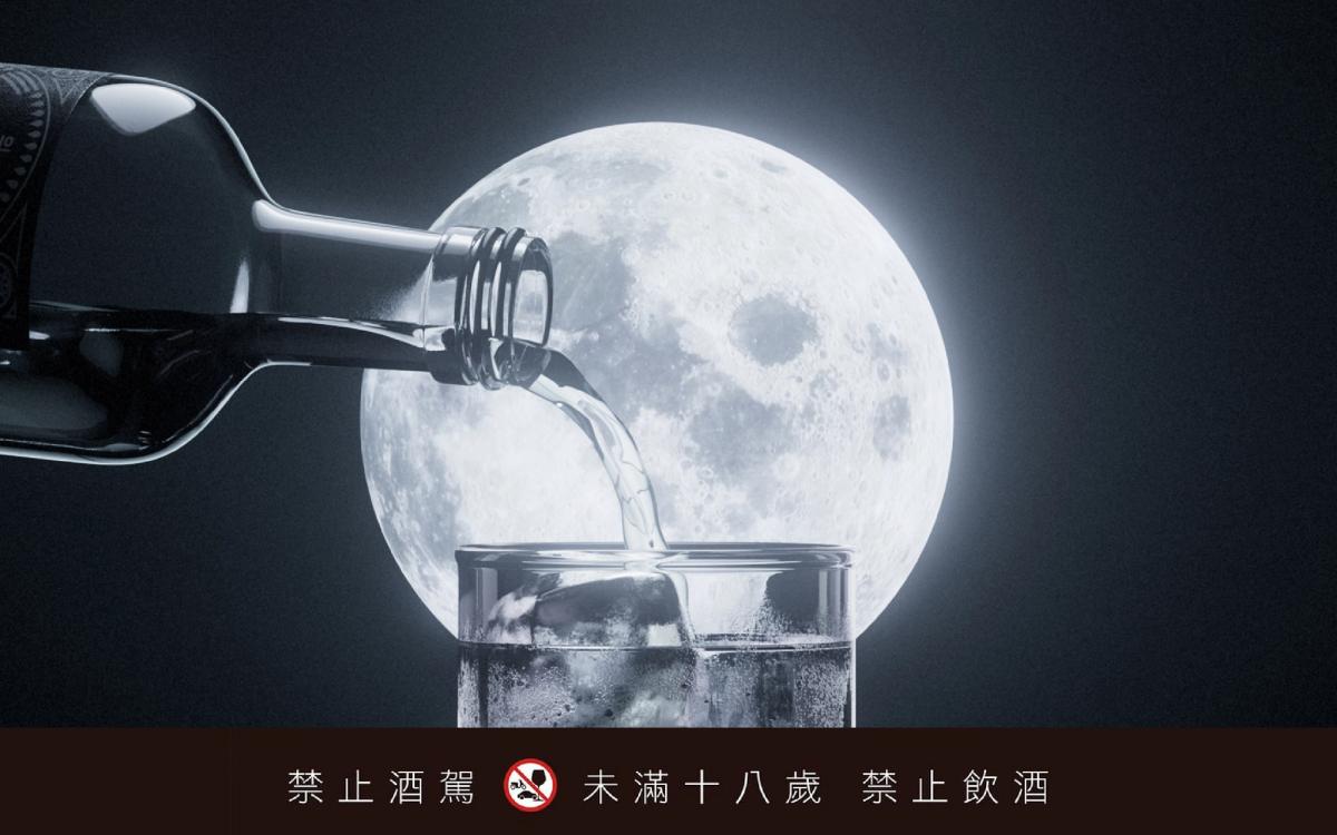
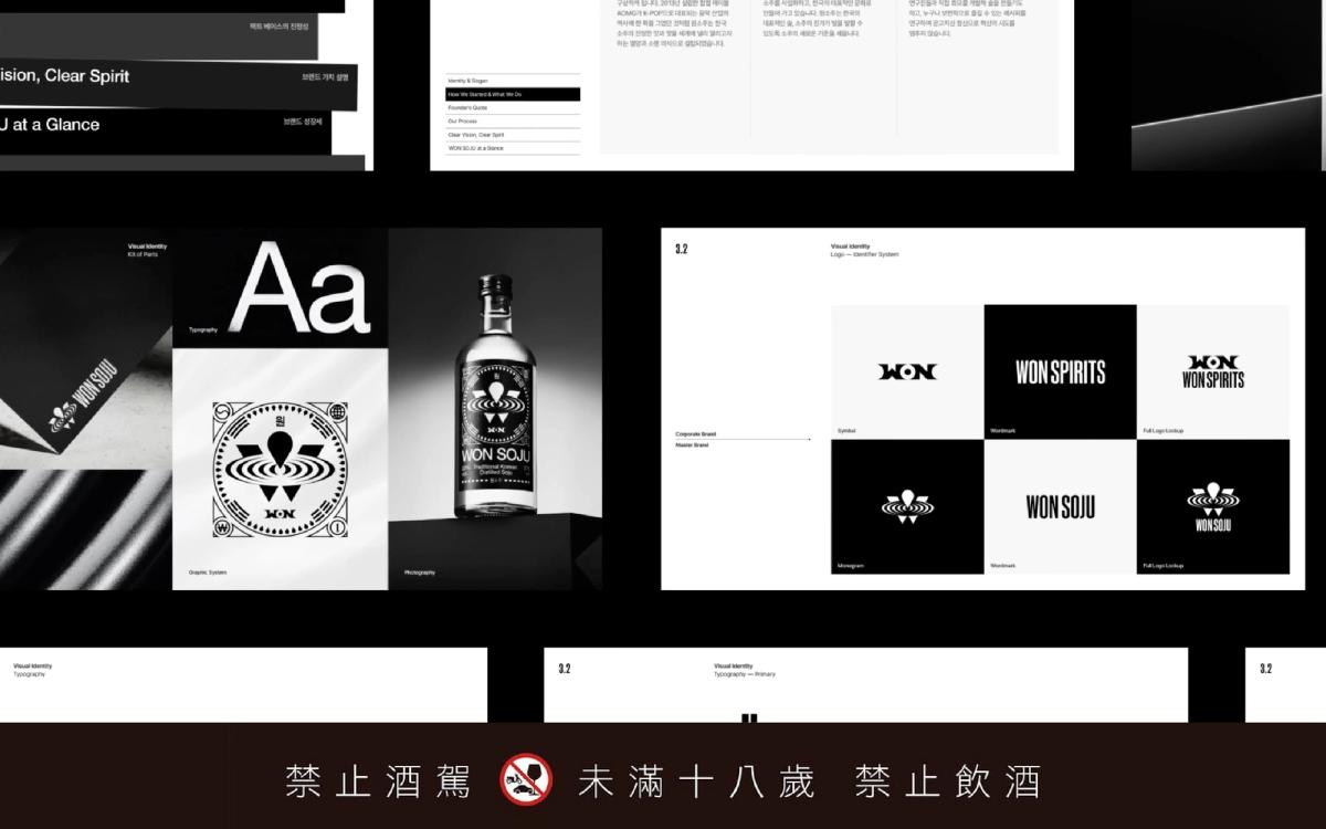
Founded by Korean hip-hop artist Jay Park (Park Jae-beom), WON SOJU decisively overturned the low-cost, green-bottle stereotype of Korean soju. A devoted soju drinker, Park has said that just as famous international artists made vodka look cool, he wanted to do the same for soju. The name Won (원) carries several associations—including “one,” aspiration or desire, and Korea’s currency,suggesting that beneath its radically new exterior, the spirit of soju remains intact. Notably, the packaging comes from top Korean design studio BAT, whose repositioning and brand strategy elevated the experience as a whole.
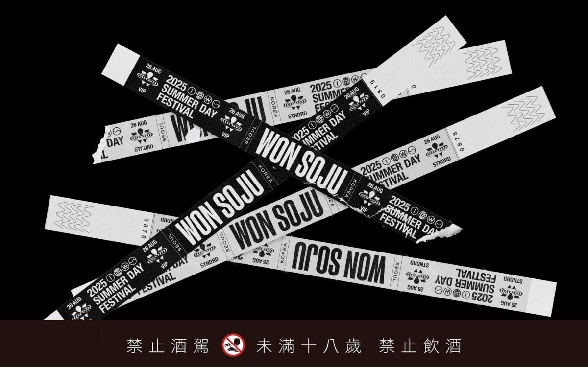
The main label and logo recombine traditional Korean motifs with street-inspired graphics. Silver foil looks especially icy and luxurious against the black label. Beyond the bottle, the brand has built an entire merchandise culture—from graphic T-shirts, bottle openers, and phone cases to the visual displays of limited pop-ups,declaring that soju no longer has to signify cheapness. Powered by its fresh design, WON SOJU broke through in Korea, expanded overseas, established itself as a leading Korean distilled-soju brand, and helped propel soju toward a more international future.
Case 03— Fine-Dining Atmosphere in a Can: SAUVIGNON LEMON BLANC HIGH BALL
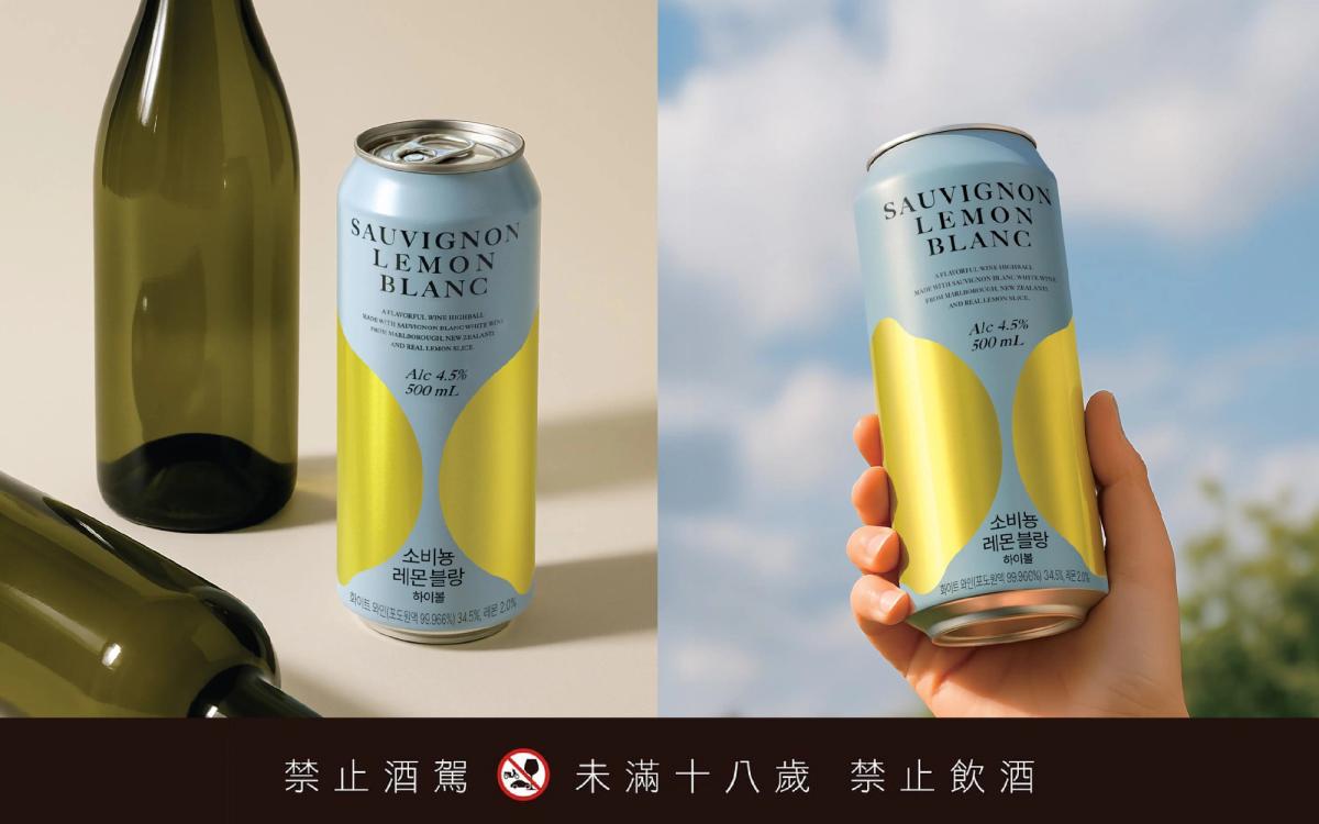
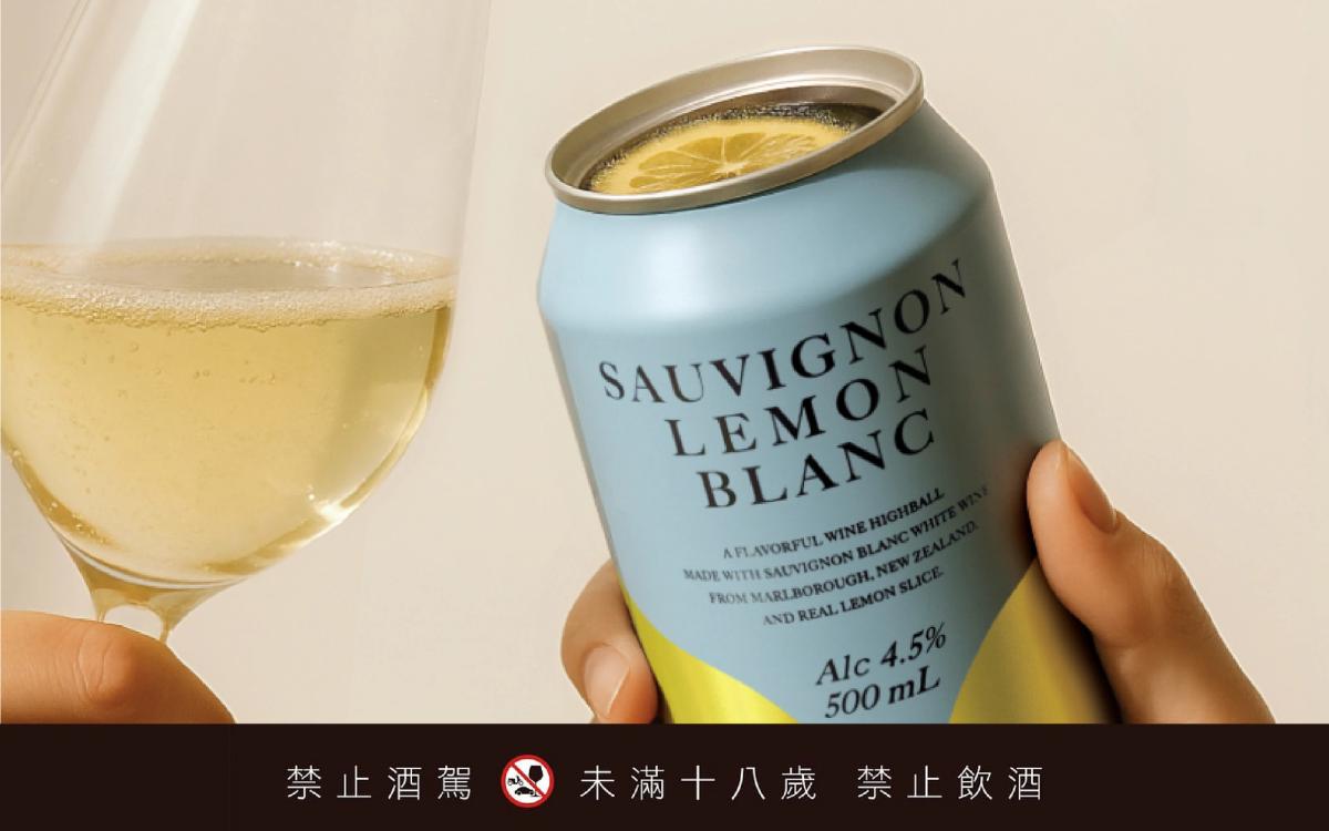
Created for Korea’s GS25 convenience stores, this lemon highball does more than stand out on the shelf: it has also earned recognition from the iF Design Award. While most highballs lean on imagery of icy refreshment and explosive fizz, this design adopts the elegance associated with white wine. A minimalist gold lemon motif is paired with refined typography, and the word “Sauvignon” appears in a finely drawn serif typeface. In design history, serifs are commonly associated with the classical, the traditional, and the luxurious. Their graceful proportions readily summon the established image of winemaking craft.
Commercial design has an unspoken code: the larger the type, the more accessible the product tends to feel; shrink the type and make it more delicate, and the object begins to feel more exclusive, and more premium.This can deliberately minimizes its flavor description and borrows the information hierarchy of a higher-priced wine label, lending it uncommon poise on a retail shelf. I also see another core principle in the premium impression it creates: restraint. Like an expensive white-wine label, it never shouts about flavor. Instead, generous white spaces and simple geometric lines—mostly white and pale tones—create a sense of purity. By echoing the labels of premium estates and natural wines, the design exudes wine-bar polish and speaks directly to young consumers who value both lifestyle quality and personal taste.
Case 04 — Adorably Collectible: KABREW Craft Beer
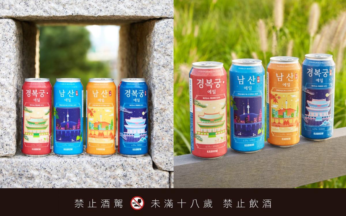
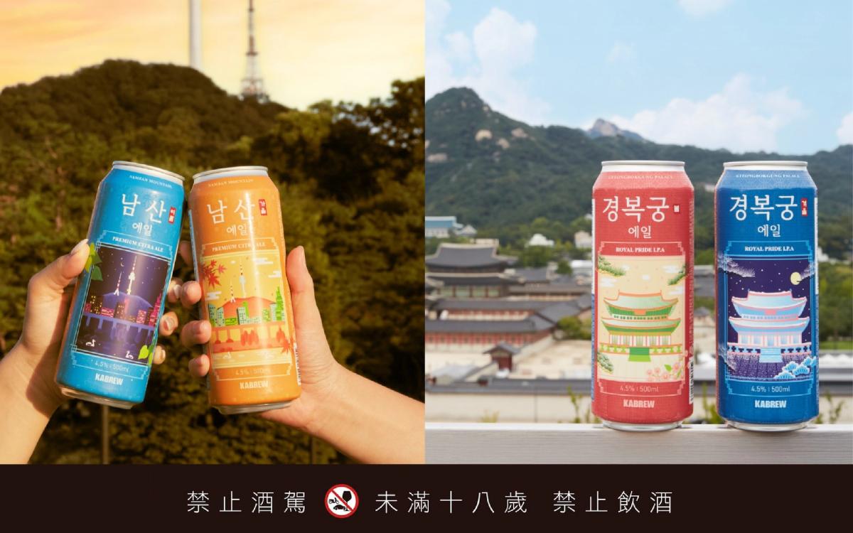
Korean craft brewery KABREW (카브루) turns each can in its Landmark Series into a miniature portrait of urban culture through a family of scenic illustrations: collecting a beer becomes almost like collecting a view. Featuring landmarks such as Gyeongbokgung Palace and N Seoul Tower, the series avoids the calligraphy and logo-forward historicism common to traditional beer labels. Instead, bright, charming flat illustrations capture the shifting light of these places at different moments of the day. Saturated palace red and deep blue evoke Korean tradition and the city at night, while finely traced rooflines bring the old architecture to life. The IPA’s concentrated hop aroma is suggested visually through warm amber orange and refreshing pale blue, awakening sensory memory before the can is opened. Framed as a city-specific series, the project succeeds as a cultural souvenir that both international visitors and Korean consumers want to collect.
Its highest-profile moment came when Gyeongbokgung Ale was served at the 2023 Korean SMEs and Entrepreneurs Convention. President Yoon Suk Yeol and the heads of major groups including Samsung and Hyundai attended, and the beer was presented as an example of cooperation between large corporations and smaller businesses. The Landmark Series has since passed 10 million cans in cumulative sales and reached 13 markets, including the United States, Germany, and Japan. On Instagram, people can often be seen photographing the can in front of Gyeongbokgung Palace itself.
Case 05 — A Smart Design That Makes Interaction Visible: Upper Deeper
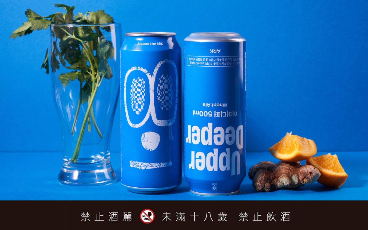
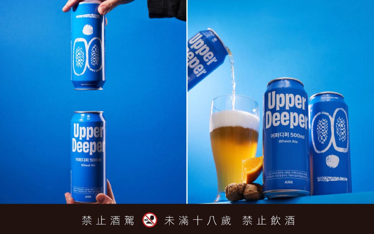
What makes this beer from Korean craft brewery ARK so engaging is the way its product photography and package orientation turn the name into something visible. The pair of symbols at the center of the can resemble wide-open eyes, but instead of the eager smile designed to please the market, they project an offhand, world-weary attitude. Against a field of ornate beer labels, the result feels unusually crisp and contemporary. The beer contains a high concentration of yeast that settles at the bottom, so the can should be briefly inverted before drinking, allowing the yeast and beer to recombine for a fuller flavor. To emphasize this ritual, the design team cleverly pairs product imagery with the typography on the physical can, prompting consumers to “flip” it: Upper suggests an uplifted mood, while Deeper points toward exploring the essence of the beer itself.
Rendered in an intensely saturated blue, the can commands attention on a convenience-store shelf and in an Instagram Story alike. Better still, ARK extended the packaging into something resembling a standalone brand through a succession of offline collaborations and pop-ups. Crossovers with well-known burger shops BURGERBOY and NOSTRESSBURGER were followed by collaborative pop-ups with Seongsu-dong fashion label luvluvluv and outdoor brand Northpeak. The pair of “world-weary eyes” leapt from the aluminum can into the many settings of young people’s lives.
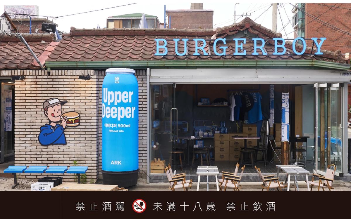
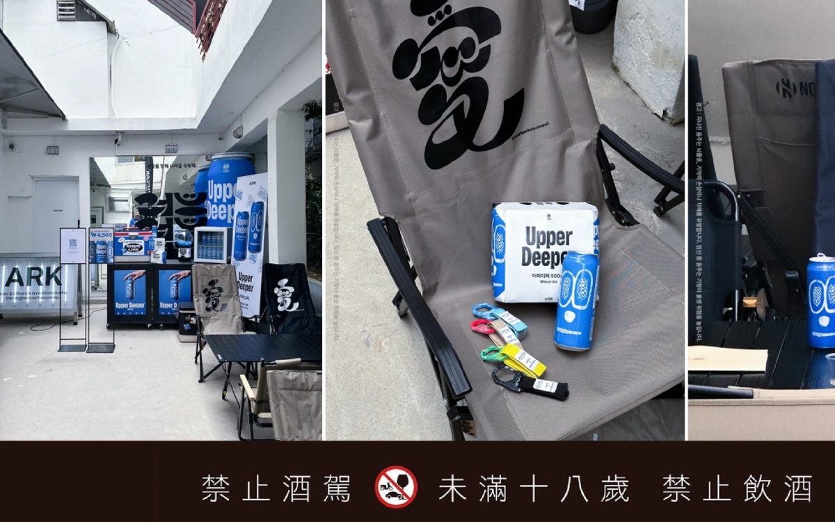
My personal favorite is Case 05, ARK’s Upper Deeper. Rather than relying on complex illustration, it makes the product name and an abstract expression the visual focus of the package. The design team, Slash Corp, is known for using brand strategy to reinterpret traditional culture in contemporary terms. Its work often strikes a precise balance between premium polish and trend-driven aesthetics, building a complete brand experience across space, graphics, and social communication. Korean designers understand exactly which settings a drink will enter after someone takes it home. To stand out in Instagram Stories,packaging needs unmistakable recognizability and strong color contrast. That clarity of purpose is one of the keys to Korean brands’ rapid rise on the global stage.

Graphic Designer.Mak
A graphic designer from Macao who now lives in Taiwan, Mak has spent nine years immersed in the design industry, often deep in the details of brand planning and packaging design. She especially enjoys “making the rounds” of supermarket shelves around the world. Beautiful typography and layouts make her heart race; an ingenious structure makes her want to take it apart on the spot. Instagram: @little_mak_